› Case Studies › Miller Vein Centers
Request a Quote
Miller Veins is a 6-location vein care company located in South Eastern Michigan. Their practice has been very successful over the years, earning a reputation as one of the most trusted vein care clinics in the United States.
While their reputation was well established with physicians and existing clients, their digital brand was not doing its job of communicating their unique advantages to the outside world. They were facing the same challenges as that many small brands do; blending in with their larger competitors and getting lost in the shuffle.
In addition to this, the vein care market is two-fold; medical patients and cosmetic patients. The brand was attracting about 5 medical patients for every 1 cosmetic patient, while the size of both potential markets were about the same. This meant there was a huge opportunity for growth in the cosmetic patient vertical.
Before beginning any copywriting or design, we needed to do a true discovery of WHO Miller Vein really was. The website was just a symptom of why they weren’t attracting the number of patients they were looking for; Miller Vein really had not yet found a way to convey their true differentiators and make their customers the hero of their brand’s story.
Through a series of interviews with the client and extensive brainstorming, we made the decision to focus the motif of the site on transparency and honesty. Whether it is true or not, in the world or vein care practice, there is a stigma attached to Doctors sometimes recommending unnecessary vein care procedures in order to bill insurance companies.
Miller Vein was a true believer in only providing their patients with the care they need and referring them to a different physician if vein deficiency wasn’t the true underlying issue. While we didn’t want to say “all other vein practitioners are bad!”, we did find a way to craft a message that articulated why over 1,400 physicians refer patients to Miller Veins.
Once we had our core message in place, we moved forward with writing copy and planning for the design of the site. This was broken into 7 sections:
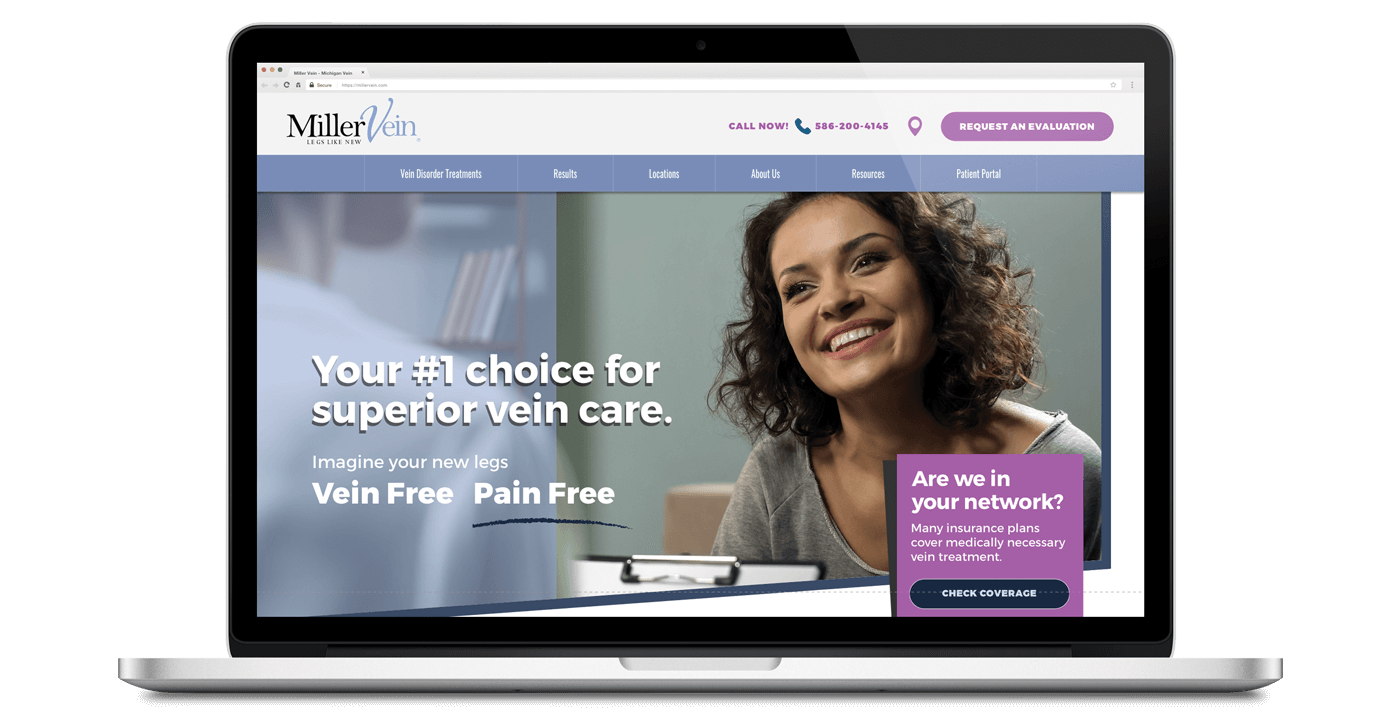
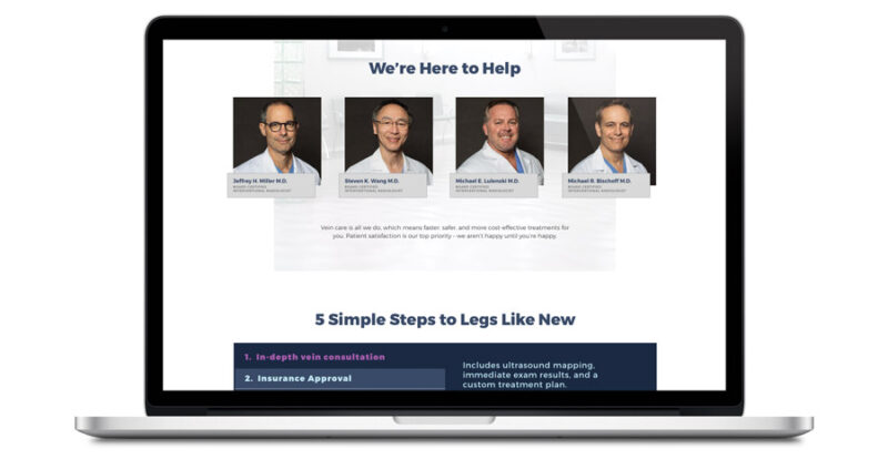
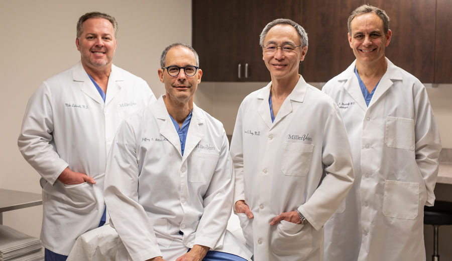
We completed a full-day video and photoshoot at the client’s office in order to capture authentic content that we could use on the website. This resulted in streaming b-roll footage that was to be showcased on the hero area of the homepage of the website as referenced above, headshots of the Doctors so we could showcase them in a professional manner, capturing the process of the patient journey, and more.
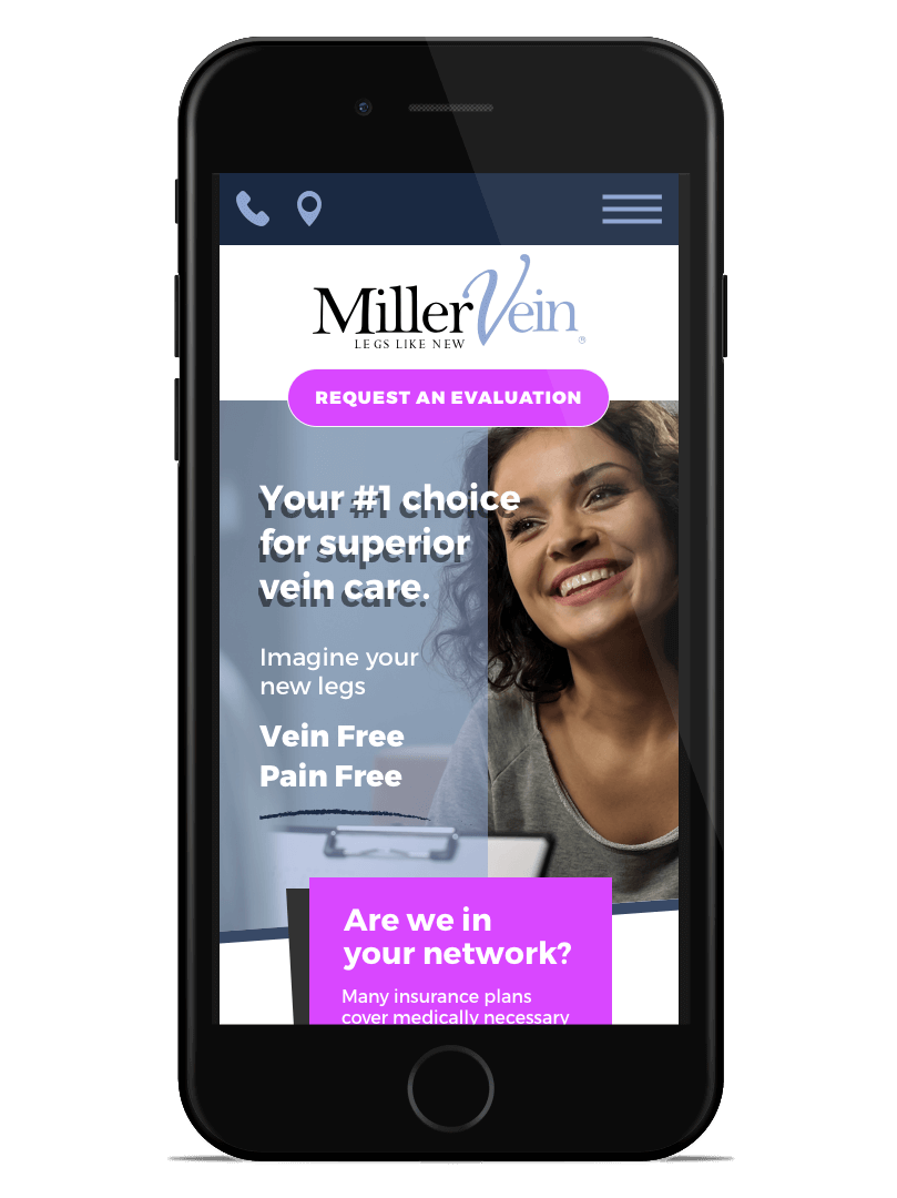
After all of the content was assembled and our structure for the site was in place, we moved into the design which is typical to our normal website design process. The client gave us creative freedom to utilize the fonts, color schemes, shapes, and overall identity that we felt fit as an organization and brand. They were going to use this design as a building block for the restructure of their outward-facing appearance. The comps we provided to the client were framed around a mobile-first strategy, as their Google Analytics account gave us insight that this was the primary source of their website traffic.
In the end, the reskinned website achieved the client’s goal of creating a more dynamic user experience that better articulates the brand’s message and motif of professional care with a staff you can treat like family. As the company continues to mature, we continue to work with client to ensure their brand message is in line with keep their patient the hero in their marketing journey.