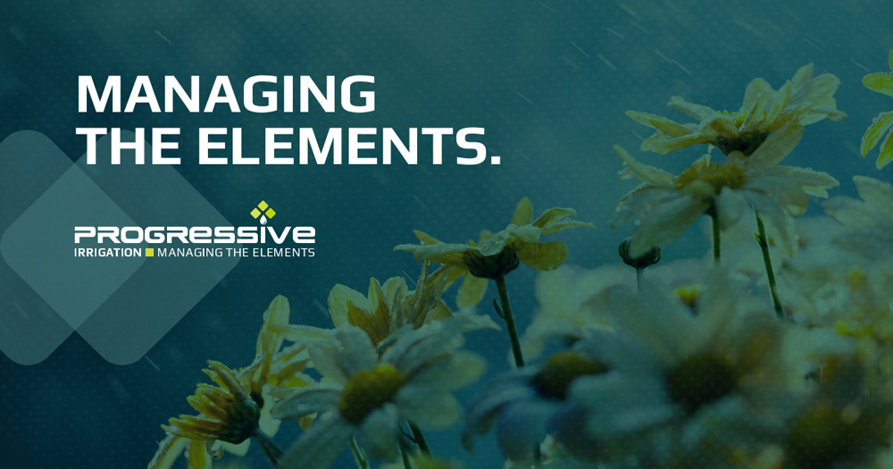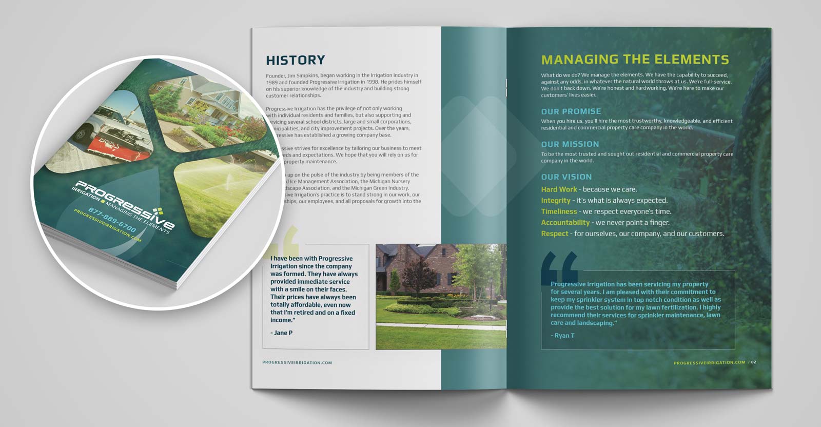
Tagline: Managing the Elements What do we do? We manage the elements. We have the capacity to succeed, against all odds, in whatever the natural world throws at us. We’re full-service. We don’t back down. We’re honest and hardworking. We’re here to make our customers’ lives easier. We also worked with Progressive and created a […]
Progressive Irrigation is a residential and property care company with a corporate headquarters in Clarkston, MI. Their services include irrigation, fertilization, lawn maintenance, hardscape, snow removal, and more.
Progressive Irrigation has grown significantly over the past 20 years. Originally started as a one-man-show in 1999 that solely offered irrigation services, the owner has grown the business to a 60+ person operation. The company was facing the same challenge as many growing businesses; creating a consistent brand identity that their customers could easily understand and remember. In addition, the company’s services had expanded dramatically, and they were having difficulty portraying the message of a full-service property care company.
Before designing the new identity, we knew it was important to develop a new message and meaning for the brand. Part of the issue was the fact that the name Progressive Irrigation itself was creating confusion; Progressive offered much, much more than irrigation services alone. We knew that there would be no deviation from the original name which has a heavy emphasis on irrigation, so we would have to find a creative way to redirect the focus to be on additional services. Therefore, we sought out a tagline that could be incorporated into the identity once we reached that stage. We had already decided we would downplay the word “irrigation” in the design of the logo and build brand awareness around the company being referred to as Progressive instead. On a national level, this would be hard to difficult due to the large Progressive Insurance brand. However, our client’s market was specifically Southeast Michigan, and already had a brand identity and awareness in the local market.
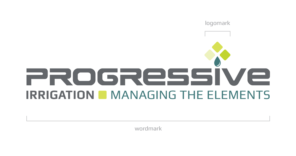
As mentioned before, we decided to incorporate the company tagline into the primary usage of the logo as we believe it was important to include this message at all touch points to ensure it would be effective. We also decided to create an icon in the logo that could be used standalone in certain applications where the type solution would either not be considered fit or maybe over-redundant. These design decisions were documented and handed to the client in a full brand identity guide.
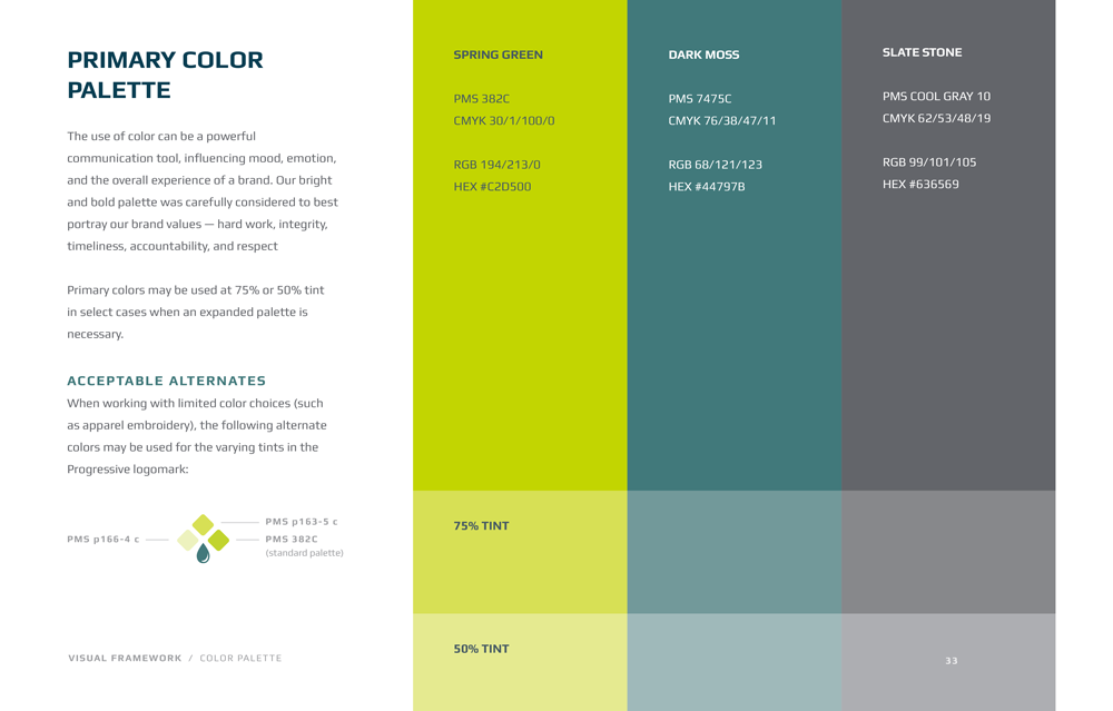
Color is a powerful communication tool that can influence mood, experience, and expectations of a brand. The bright and bold colors selected for the brand were carefully considered to best portray the brand’s values of hard work, integrity, timeliness, accountability, and respect.
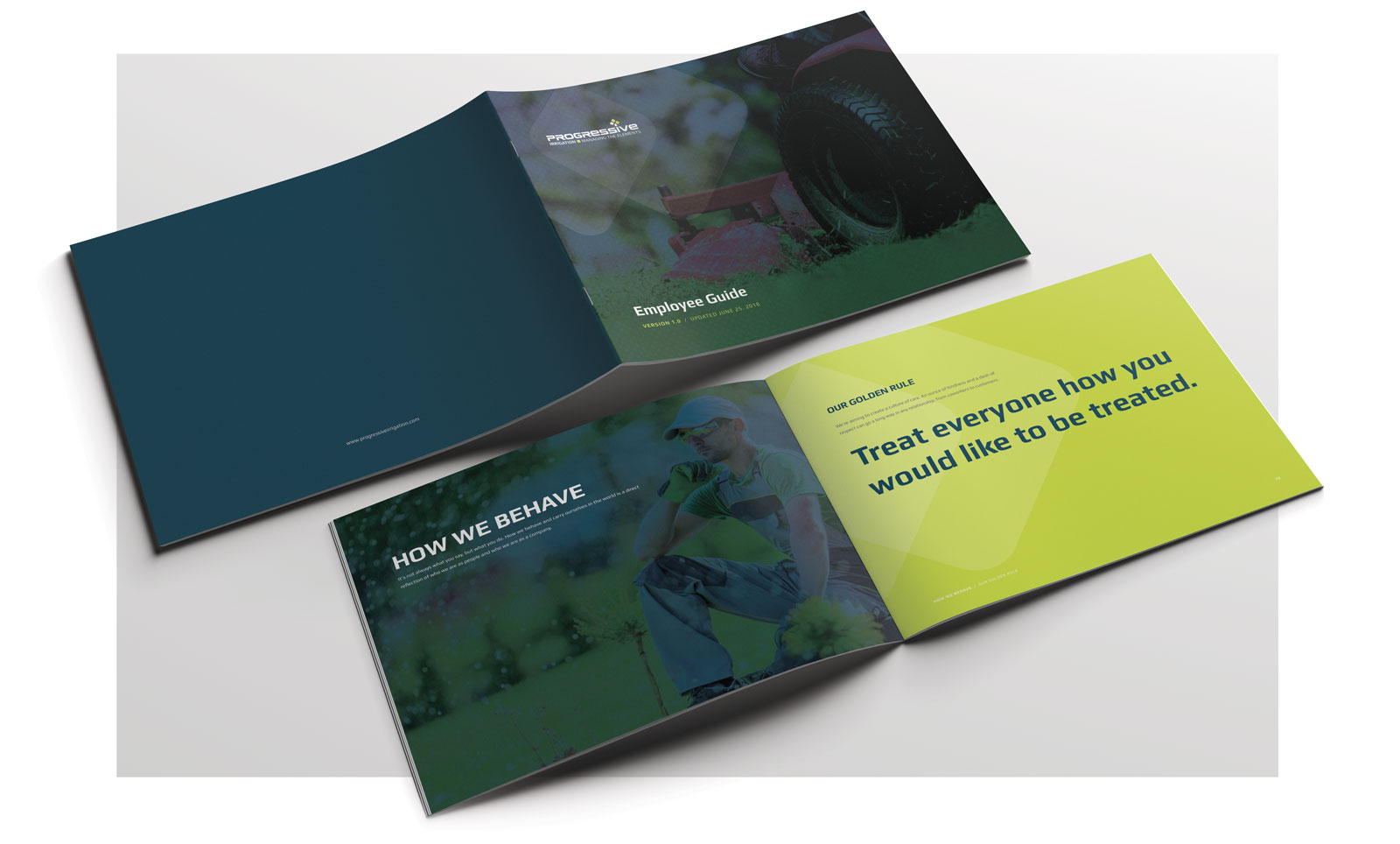
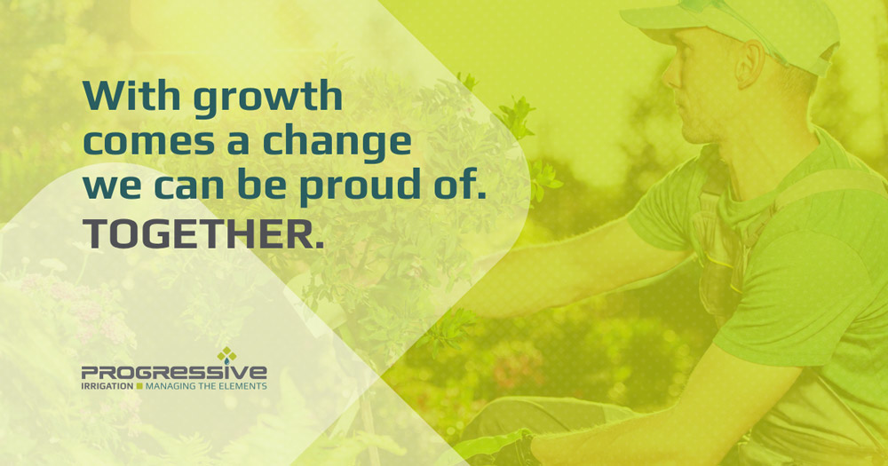
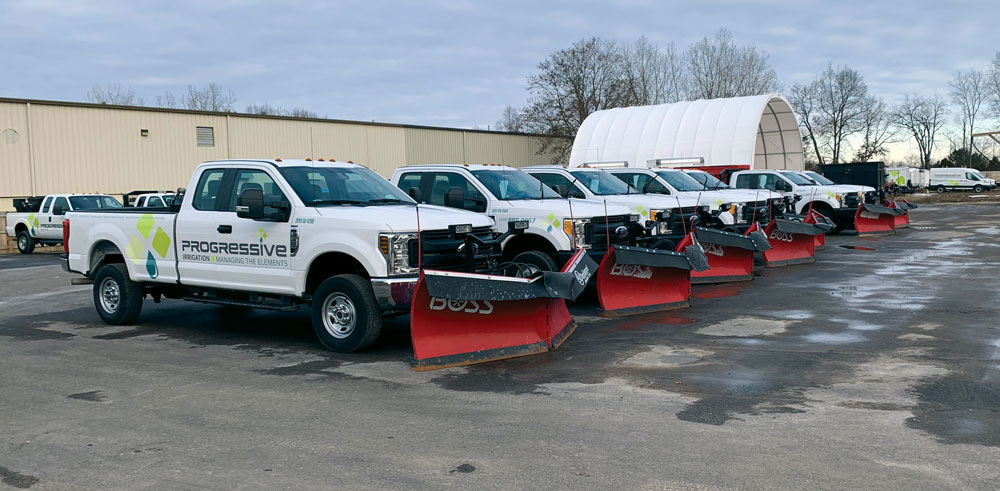
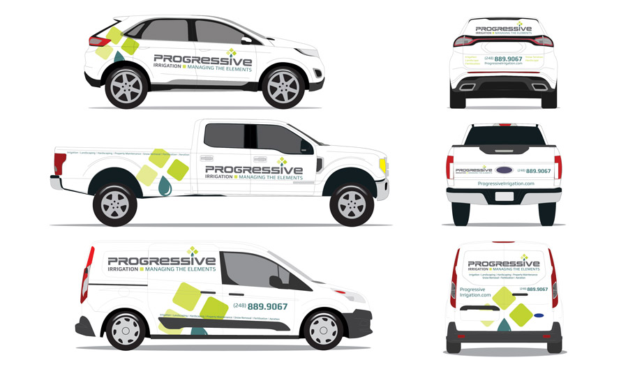
After completing the identity of the brand, we brought it into the real world. This came in the form of the vehicle wraps, stationary, business cards, a branded letter to the customer explaining the brand’s change, uniforms, signage, social media headers, and social content.
In the end, we successfully create a new brand identity for Progressive that positioned them as a professional property care company. Since the rebranding, they have opened a second location in Gaylord, MI and purchased several other companies within their space, all while boosting their overall revenue. They now stand shoulder to shoulder with larger competitors and are winning.
What do we do? We manage the elements. We have the capacity to succeed, against all odds, in whatever the natural world throws at us. We’re full-service. We don’t back down. We’re honest and hardworking. We’re here to make our customers’ lives easier. We also worked with Progressive and created a new brand promise and mission statement for the company to live by. This was to be used not only in external communications but internally as well. The client found this to be a great technique in getting the entire organization in line with the core values of the company moving forward.
“To be the most trusted and sought out residential and commercial property care company in the world”.
“When you hire us, you’ll hire the most trustworthy, knowledgeable, and efficient residential and property care company in the world”. After defining the brand’s messaging, we started working on the new logo and identity for Progressive.
