› Case Studies › Revolution Laser Tag & Arcade
Request a Quote
Revolution Laser Tag and Arcade (RLTA) is Michigan’s premier laser tag arena. The facility accommodates a diverse spectrum of customers, ranging from kids birthday parties to a night out on the town for adults.
RLTA was purchased from a previously owned identity under a different name that had major reputation concerns in the local market. RLTA turned to us for advice on how they could overcome this persona. It was mutually decided that the facility needed to go through a complete renaming and rebranding process in order to achieve success.
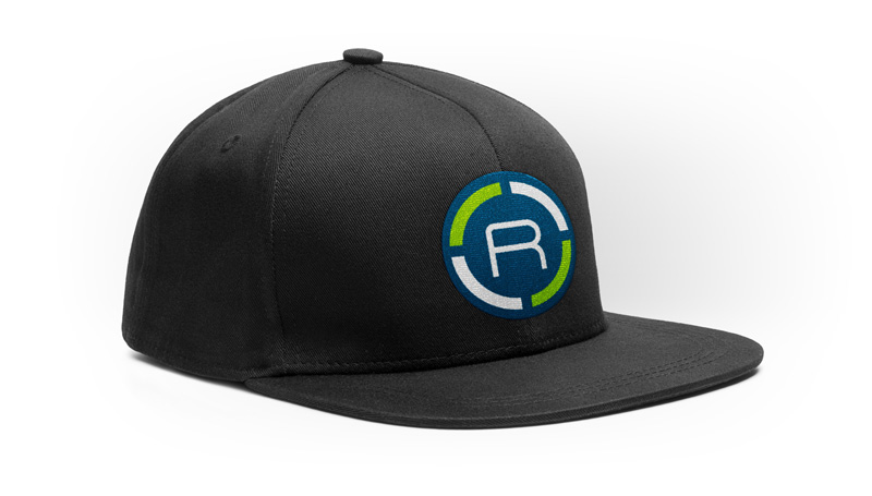
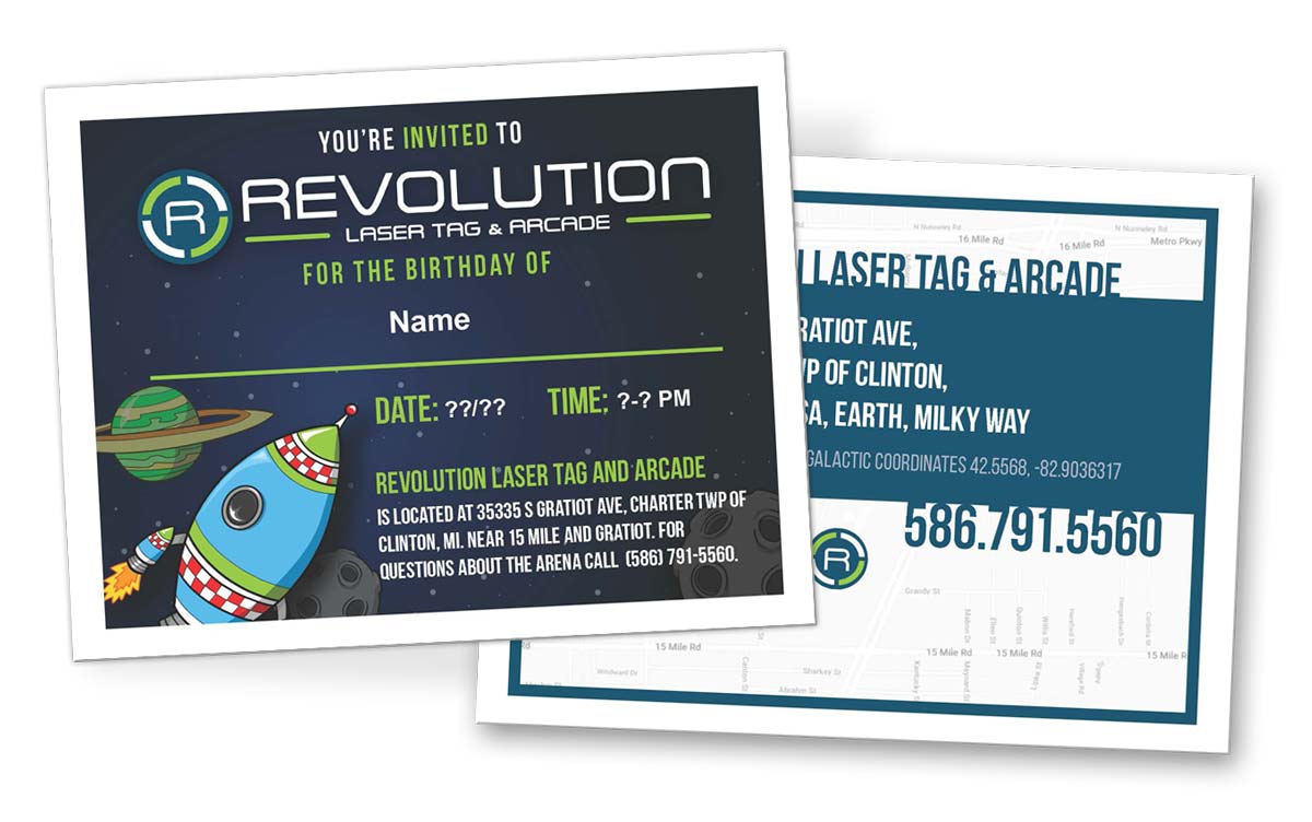
With the new owner, we collectively decided upon Revolution Laser Tag & Arcade as the new name. We chose to utilize a “marine-alien” motif for the overall look and feel of the logo and brand, which meshed well with the graphics and atmosphere inside the arena itself. The new brand was playful enough to attract our target market and a complete departure from the previously tarnished reputation.
After completing the new logo, we designed a series of staff uniforms. We decided that a fluorescent green designed shirt was best for our client, so that staff members were easily identifiable within the facility and the darker laser tag arena area. We also developed a new monument sign for the front of the building, with a focus on making sure the words “LASER TAG & ARCADE” were readable from any distance. This was important for the vast amount of drive by traffic on Gratiot road.
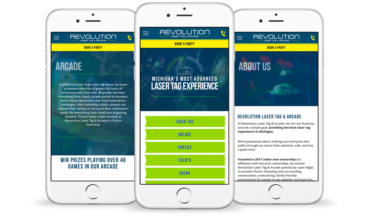
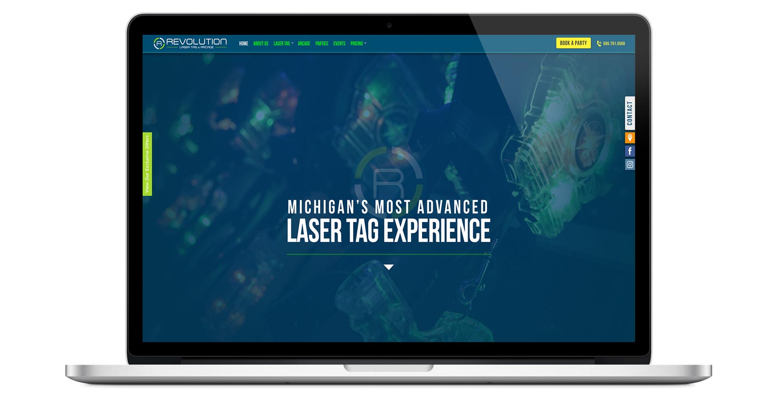
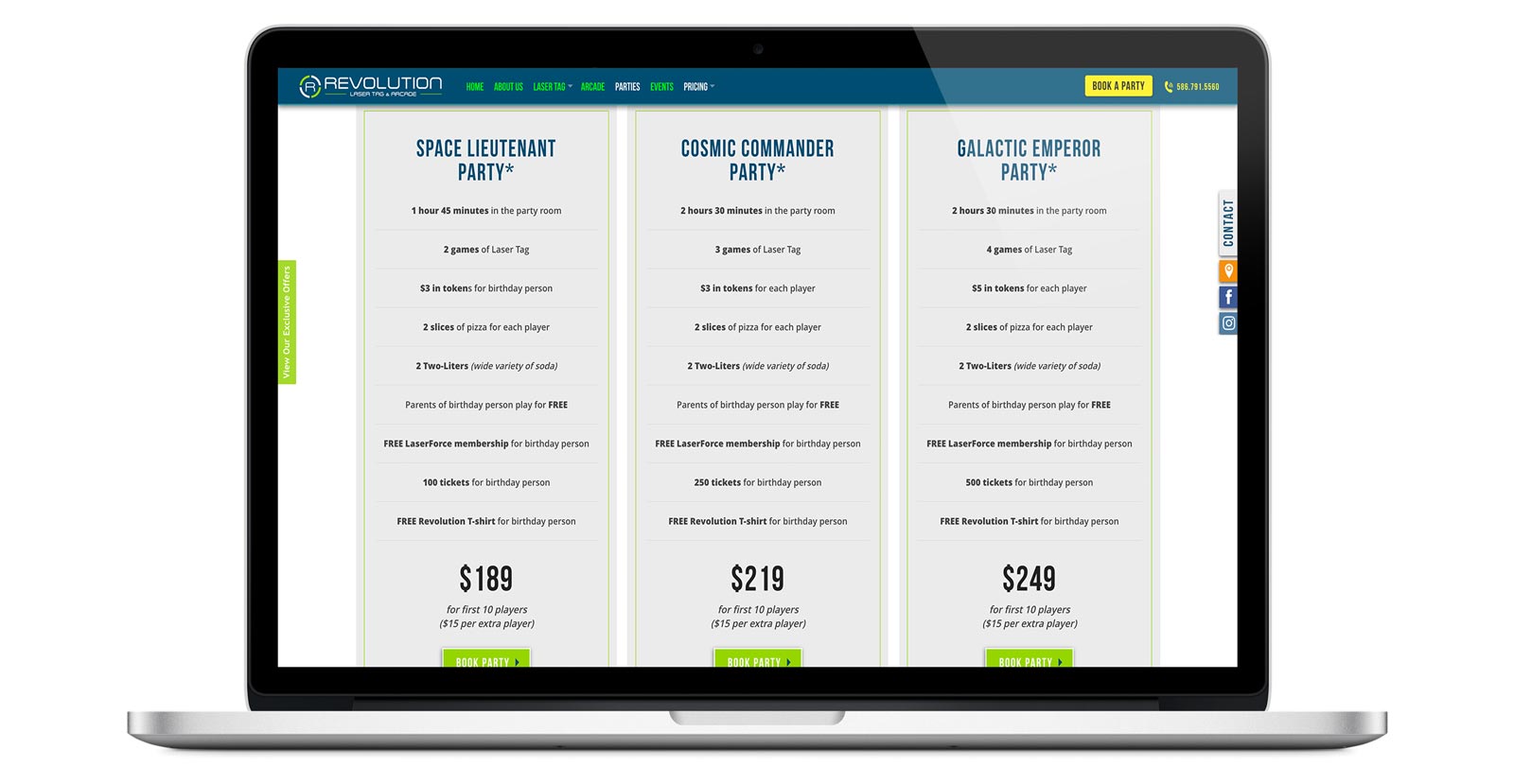
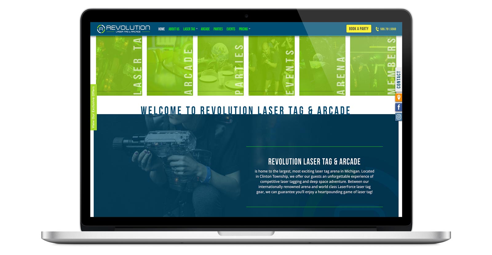
We designed the new website with simplicity in mind. Transparent, competitive pricing is listed throughout the website, along with a strong calls-to-action to drive more traffic to the arena and event bookings. We utilized the digital assets from the photo shoot to better convey the size and uniqueness of the facility. We also added an event calendar to showcase what is happening at RLTA to keep the community engaged with upcoming events.
The guys at Drive did a fantastic job with our new website and logo! It turned out better than I could have dreamed! We have received so many compliments about the website - "the website is so easy to find info," "the website makes it easy to get what you need," and "We love the email feature." The logo has also received equally good compliments, mainly because it helps people get the bad taste of the former owners out, and helps to show that the new employees, managers, and owners are willing to go above and beyond to make their experience memorable! Thank you for the excellent work.
Kevin Thomas General Manager