› Case Studies › Wipers123
Request a Quote

Wipers123 is an e-commerce business that exclusively sells windshield wiper blades. Their business model is simple; provide a platform where people can seamlessly locate and purchase windshield wiper blades for their vehicle.
Wipers123 conducted research on the marketplace, and concluded there was an opportunity for them to take advantage of the largest consumer demographic in America; millennials. However, their brand was stale and was not aligned to properly connect with this demographic. We were hired by Wipers123 to execute a complete rebranding that would better position them for their new target market.

We created a baseline guide that allowed our agency and the client to fully understand who the brand was going to be before any creative was actually performed. This was done by performing a complete SWOT analysis, which drove even deeper into what truly sets Wipers123.com aside from other retailers. In addition to this, a buyers persona guide was created that unveiled more information about the interests of our audience, why they interact with brands, and potential pitfalls we could encounter and how we would avoid these.
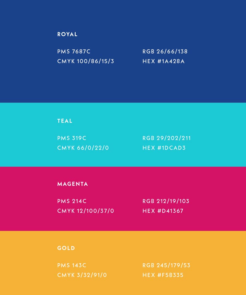
The logo identity we designed for Wipers123.com was a reflection of the brands personality. The color choice of royal blue is typically a conservative scheme, but when paired with teal and magenta it gave us the witty flare we were going for.
Our primary manipulated font selection of Neue Kabel gave the logo a much fresher feel than the original logo which had become dated with time. The circular windshield wiper icon we designed had the forethought that this would be iconic enough to stand alone after consumers gained familiarity with the brand.
After designing the logo, we set parameters around correct and incorrect usage of the logo. This also included proper type hierarchy and color usages that could be utilized with the brand, which is key with creating any type of identity consistent.
Running in tandem with the design of the identity, our creative team worked on the overall attitude, tonality, and voice of the brand. We helped the client craft a strong mission statement, vision, brand values, and brand promise that better spoke to their audience. This branched off into establishing the brands voice in media, taglines, and the overall attitude of Wipers123.com. In short, our efforts made this brand a living breathing entity that would stand out among the pack.
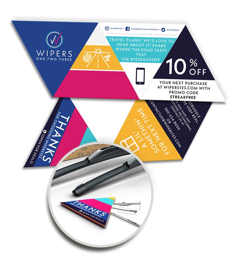
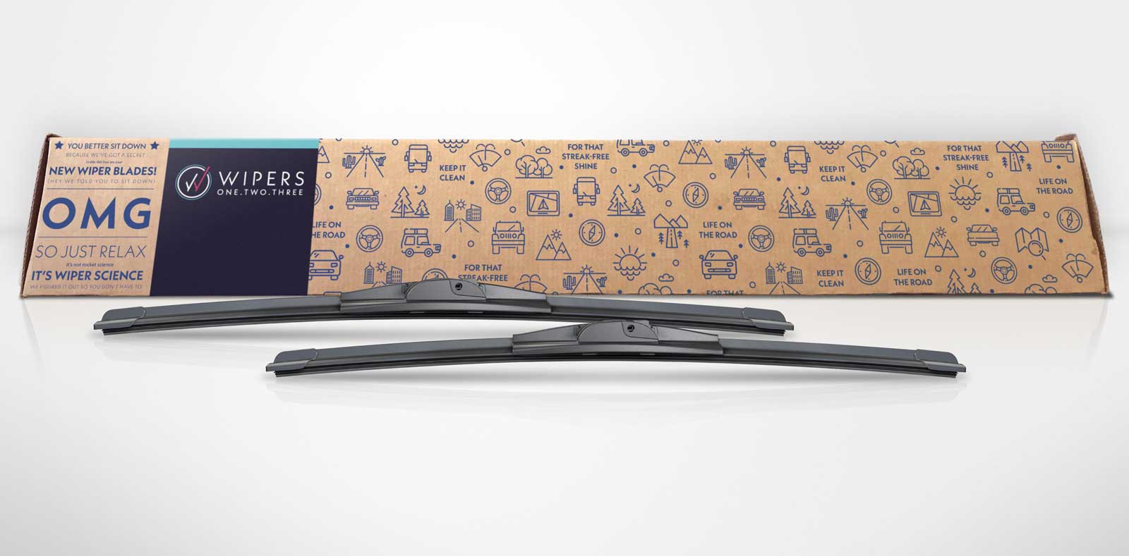
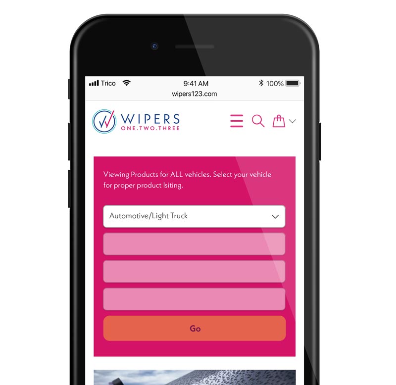
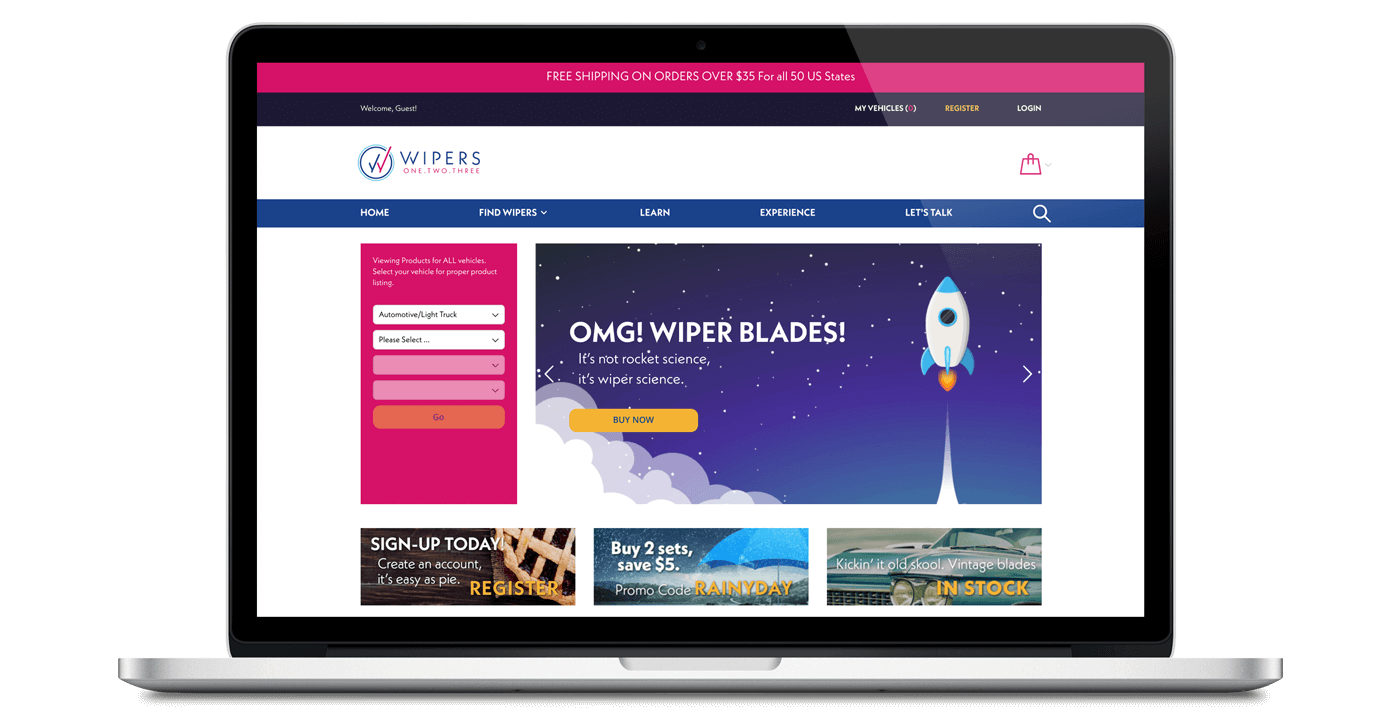
Once our brand guidelines were completed, we began working with Wipers123.com on the design of their real-world and digital assets. This included a complete redesign of their e-commerce website Wipers123.com, conception and implementation of new product packaging, revamping of their social media profiles, and more.